Freelance Portfolio Website
Freelance Portfolio Website
Designed a freelance portfolio website for designers, focusing on simplicity, creativity, and user-friendly navigation to showcase their work effectively and attract potential clients.
Project Overview
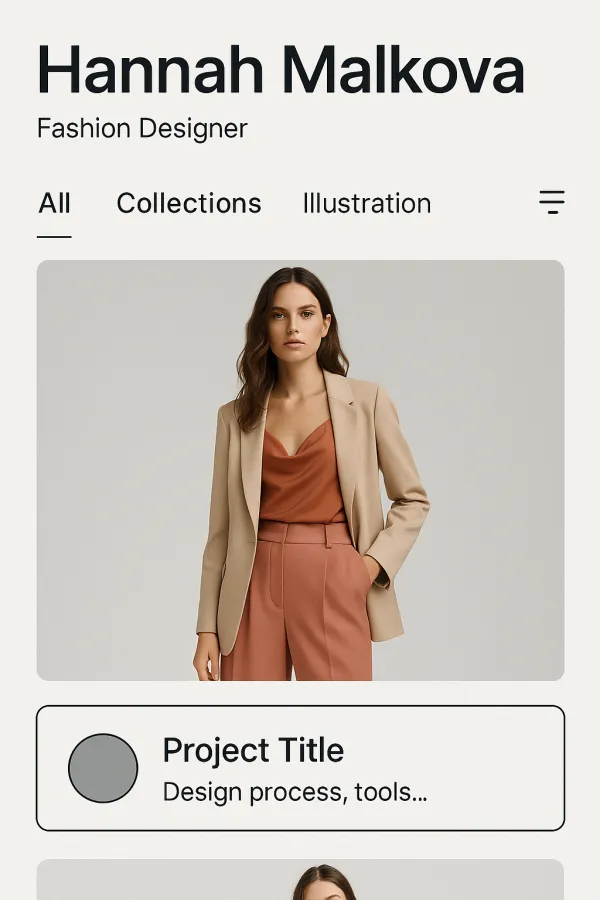
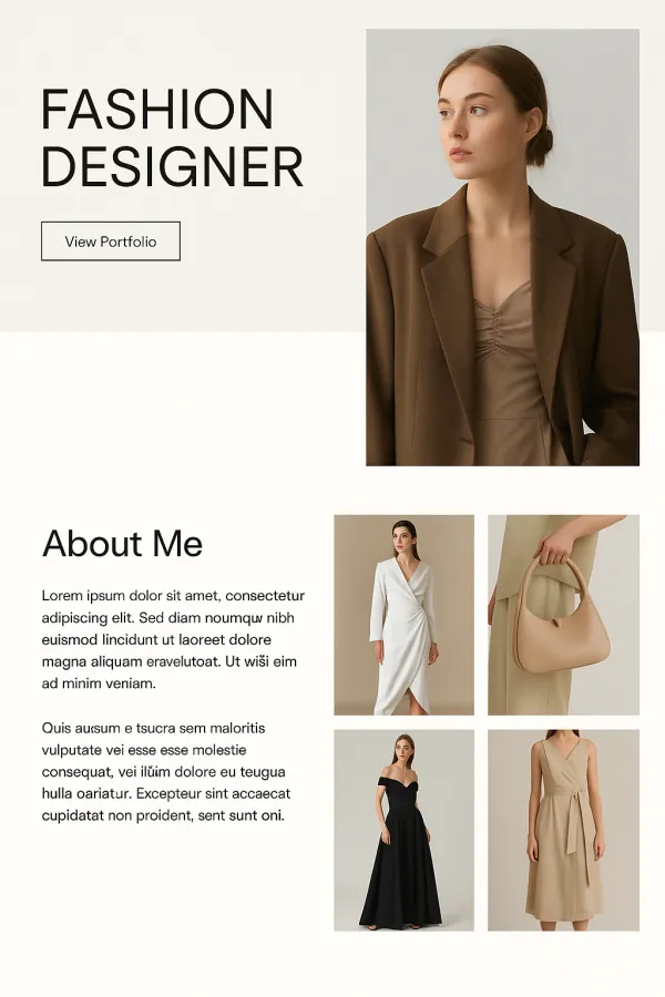
As part of my internship at PixelCraft Solutions, I worked on designing a website for freelance designers. The goal was to create a digital portfolio that allowed freelance designers to showcase their work in a visually striking and functional manner. I began by researching the most effective ways for designers to present their portfolios online, studying various trends and looking for ways to make the user experience stand out. I worked on designing a layout that allowed for easy browsing of multiple projects, with clear categorization of design types and a user-friendly navigation system. I also focused on adding features that allowed designers to display additional information about each project, such as the design process, tools used, and client testimonials, which would help attract potential clients. One of the main challenges I faced during this project was finding a balance between creativity and simplicity. I wanted the website to reflect the creative nature of the work being displayed while ensuring it was easy to navigate and read. The final design was a responsive, visually appealing portfolio website with clean lines, high-quality images, and a simple layout that highlighted the work and expertise of the designer. This project gave me valuable experience in designing for a very specific user group—freelance designers—and taught me how to make a creative portfolio that was both functional and eye-catching.
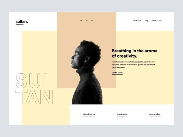
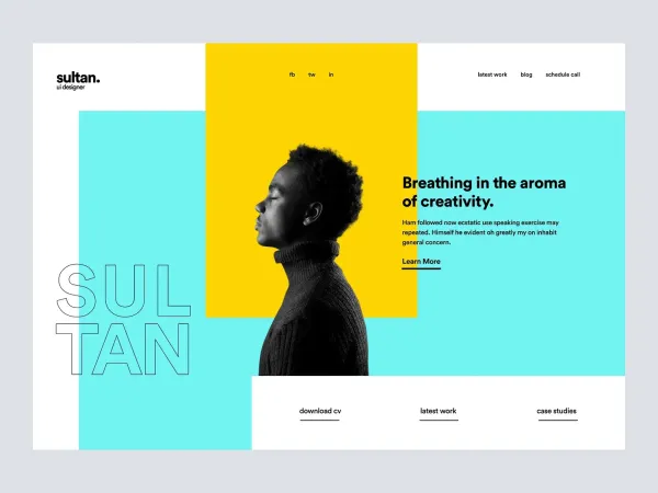
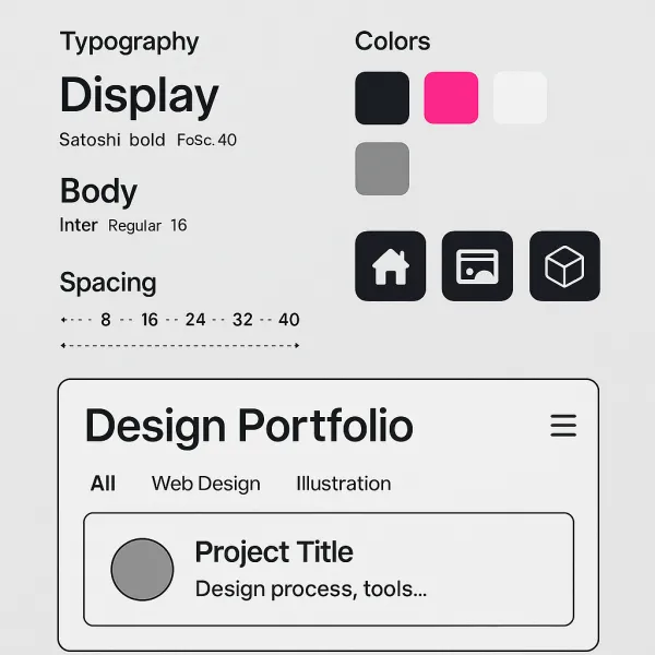
Project Images
Project Claps
Recent Clappers
Showing 8 of 129 clappers Bibhu Prasad
 Bibhu Prasad
 Anurag Prasoon
 Ankita Thakur
 Hassan Sabah
 Aadi Chaulagain
Discussion
Please log in to join the discussion.