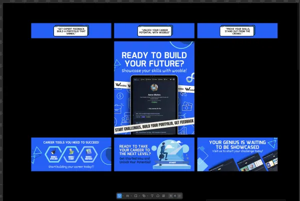
Project Overview
Project Title: FinFlow – Personal Finance Tracker Landing Page
DesignVerse Competition Round 1
Overview and Context
This project was developed as the initial submission for Round 1 of the DesignVerse UI UX Competition, focusing on the Personal Finance Tracker theme. The primary objective was to design and develop a high-fidelity, single-page landing experience for a hypothetical mobile application, FinFlow, aimed specifically at college students. The goal was to create an intuitive, motivating, and visually appealing introduction to the app that addresses common student financial challenges.
The Challenge
College students often face unique financial pressures, including managing limited budgets, tracking diverse expenses such as tuition, living, and social costs, and setting realistic savings goals, all while navigating their academic lives. Traditional finance tools can be intimidating, complex, or lack the motivational elements crucial for young adults. The core problem was to design a landing page that could resonate with this audience, convincing them that FinFlow offers a simple, approachable, and effective solution to their financial anxieties.
Our Solution and Design Approach
The FinFlow landing page was conceived as a conversion-centric experience, guiding potential users seamlessly from initial awareness to a clear call to action. Our design philosophy centered on simplicity, clarity, and motivation.
User-Centric Information Architecture
The page is structured to flow logically, starting with a powerful hook in the hero section, followed by clear value propositions in the feature highlights, social proof and emotional connection in the engagement section, and concluding with a prominent call to action. This linear journey minimizes cognitive load and maximizes understanding.
Calming and Trustworthy Visual Design
We adopted the Calm Horizon color palette, primarily utilizing soft teal, vibrant orange accents, and clean whites and grays. This palette was carefully chosen to evoke feelings of trust, clarity, and optimism, directly counteracting the stress often associated with finance. All color choices adhere to WCAG AA accessibility standards.
Engaging and Unique Visuals
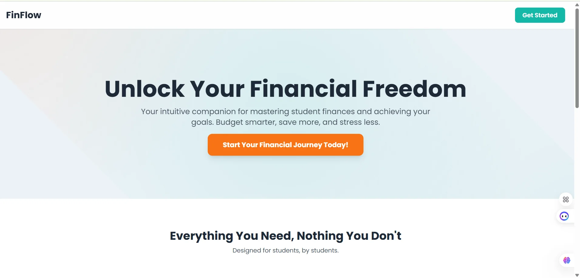
Abstract Hero Background
Instead of generic stock photos, a dynamic CSS gradient background was custom-designed. This abstract visual metaphorically represents the journey from financial complexity to clarity and growth, creating a sophisticated and memorable first impression.
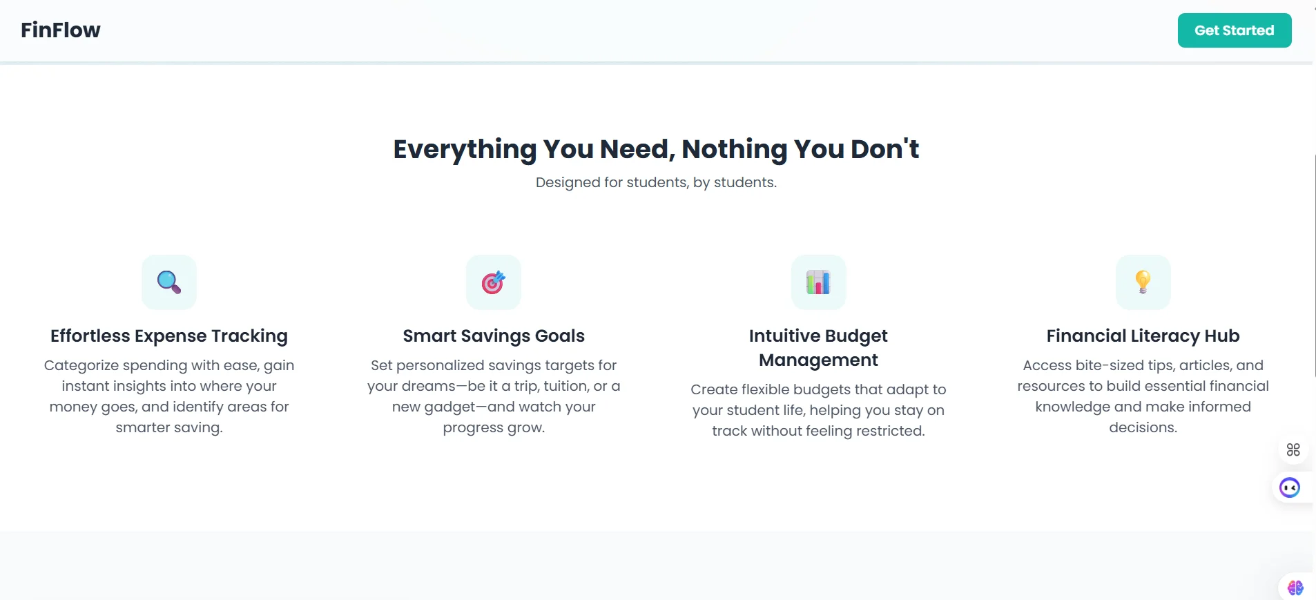
Custom Feature Icons
Simple, universal Unicode characters styled with custom CSS were used to represent features. This approach adheres to competition constraints with no SVG while maintaining a unique brand identity and clear visual communication.
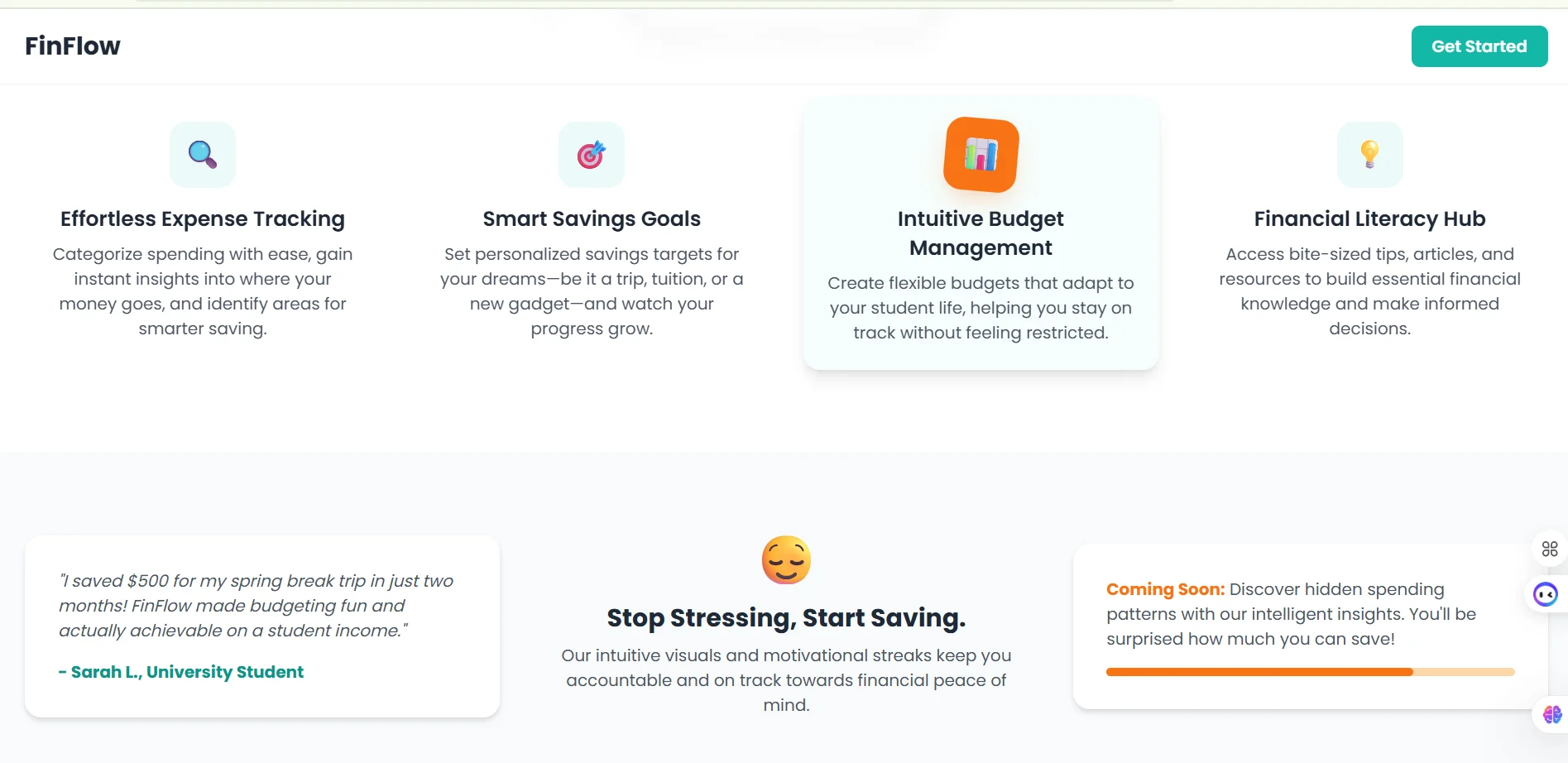
Interactive Polish
Subtle CSS animations and hover effects were integrated to enhance user engagement without overwhelming the experience. These include a dynamic hero background, a shine effect on primary call to action buttons, and subtle lifts and shadows on feature cards, adding a layer of professionalism and interactivity.
Responsive Design
Developed with a mobile-first mindset using Tailwind CSS, ensuring a seamless and optimal viewing experience across all devices including mobile, tablet, and desktop without horizontal scrolling.
Role and Tools
Role included UI UX Designer, Front-end Developer, and Information Architect.
Tools used were HTML5, CSS3, Tailwind CSS, and Vanilla JavaScript for scroll animations and minor interactive effects.
Impact and Outcome
The FinFlow landing page successfully communicates the app's value proposition in a compelling and accessible manner. By focusing on the emotional and practical needs of college students, it aims to
Educate by clearly presenting key features and benefits
Motivate by inspiring students to take control of their finances
Convert by driving sign-ups for the app through a frictionless and trustworthy introduction
This design showcases a strong understanding of user psychology, modern web aesthetics, and robust front-end development, making it an impactful foundation for a successful product.