Execution > Potential

personal
Execution > Potential
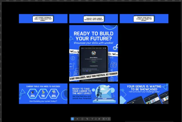
The tone is firm but respectful, showing clarity without sounding arrogant. I used bold typography to create strong visual hierarchy and quick readability. The design focuses on message clarity over decoration to match the brand tone. I deliberately avoided aggressive wording and excessive visual elements.
Project Overview
The tone is firm but respectful, showing clarity without sounding arrogant. I used bold typography to create strong visual hierarchy and quick readability. The design focuses on message clarity over decoration to match the brand tone. I deliberately avoided aggressive wording and excessive visual elements.
Project Images
Project Claps
0
claps
No claps yet. Be the first to clap for this project!
Discussion
Please log in to join the discussion.