FitnessAPP

FitnessAPP
Project thumbnail
Project thumbnail
Project thumbnail
Project 🌱 Early Work

FitnessAPP

A modern fitness app designed to help users stay on track with their workouts, set personalized fitness goals, and compete with ease.

UI/UX Figma Fitness

Project Overview

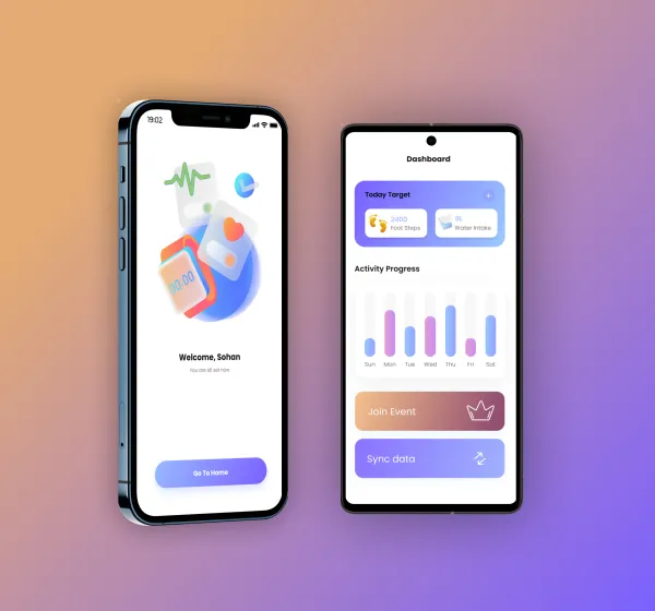
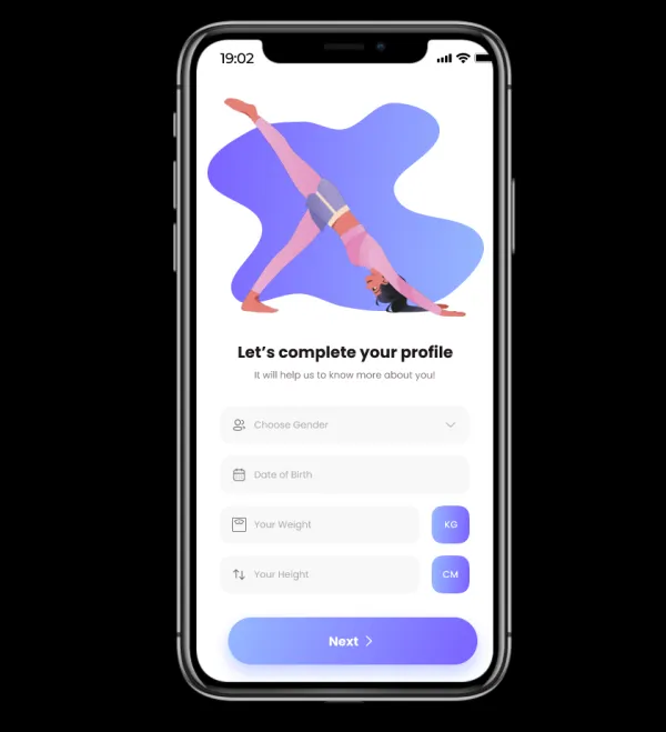
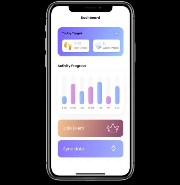
🏋️ FitnessAPP – Fitness Made Simple & Smart Say hello to FitnessAPP, a sleek and intuitive fitness app built to empower users in their health and wellness journey! 🌟📲 Whether you're a beginner or a fitness enthusiast, this app helps you plan, track, and achieve your goals with ease. Designed with a clean UI and user-friendly experience in mind, FitTrack lets you: ✅ Create personalized workout routines 📈 Track your progress in real-time 🔔 Get reminders & motivational boosts 🚀 Built using modern tools and UI/UX principles to combine aesthetics with functionality.

Project Images

Project Claps

6 claps

Discussion

Please log in to join the discussion.

More by  Sohan Pattnaik

Similar Projects

Engagement Audit & Redesign (Advanced)

Engagement Audit & Redesign (Advanced)

Pick any existing Wooble social media post (Instagram or LinkedIn). Post i picked : (2nd image) 1. What works: The original post actually has a clear message. Using icons for each skill helps people scan the information quickly, which is a big plus for social media. The "Independent Thinking" lightbulb right over the head is a bit cliché, but it gets the point across. 2. What doesn’t: It feels very "AI-generated" in a way that’s getting a bit old for people on LinkedIn. The lighting is too perfect, the person looks a bit robotic, and the "arena" background is kind of intense. Even the icons and text, the whole post is just a single AI generated image. Nowadays, with the increasing rise of almost everyone using AI, relying entirely on AI does not give the user an edge and they have nothing to set them apart from others . 3. What’s unclear: The hierarchy is a little messy. My eye jumps from the title to the lightbulb, then tries to circle around all five skills while also looking at the person in the middle. There's just too much competing for attention at once. 4. What’s missing: Personality. It feels like a page from a corporate textbook. There’s no "edge" or specific brand voice that makes me think, "Oh, this is definitely a Wooble post." It lacks that "stop-scrolling-because-this-is-different" factor. 5. One missed engagement opportunity: The original post is too "closed." It gives the info and that's it. It doesn't really challenge the reader or force them to look at the caption to find out what those "5 things" actually are—it just lists them all right there, so there's no mystery left to click on. My Redesign: 1st Image

Arpita Dash Arpita Dash