Responsive Website Design
Project
Foundational
Responsive Website Design
Designed mobile-first website layouts with responsive designs, ensuring accessibility and functionality across all devices.
Web Design
Responsive Layouts
User Testing
Project Overview
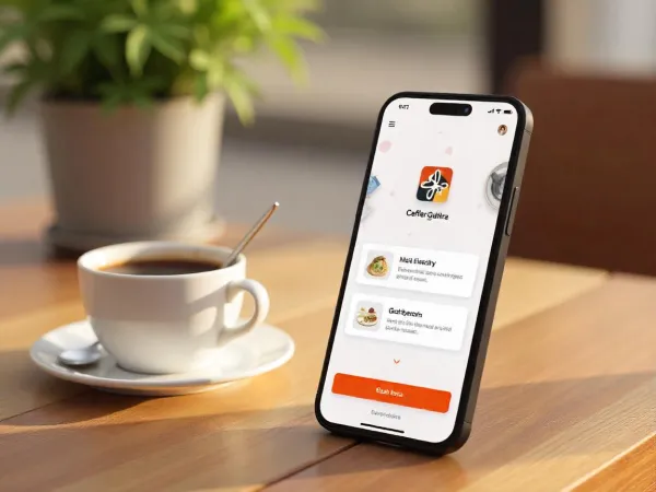
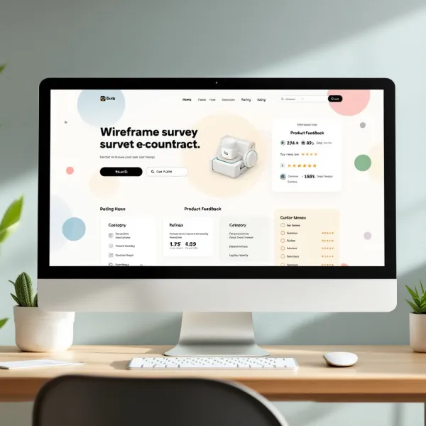
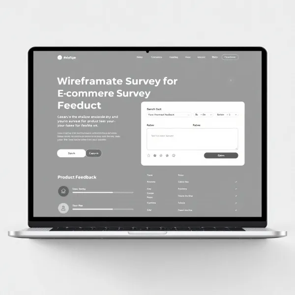
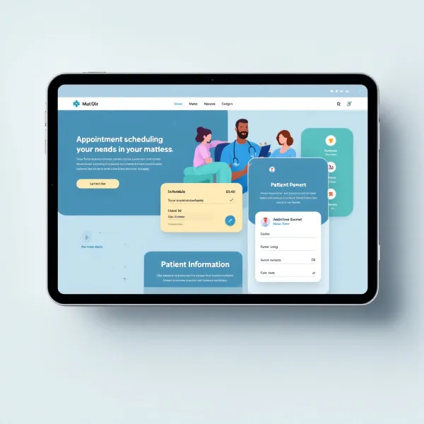
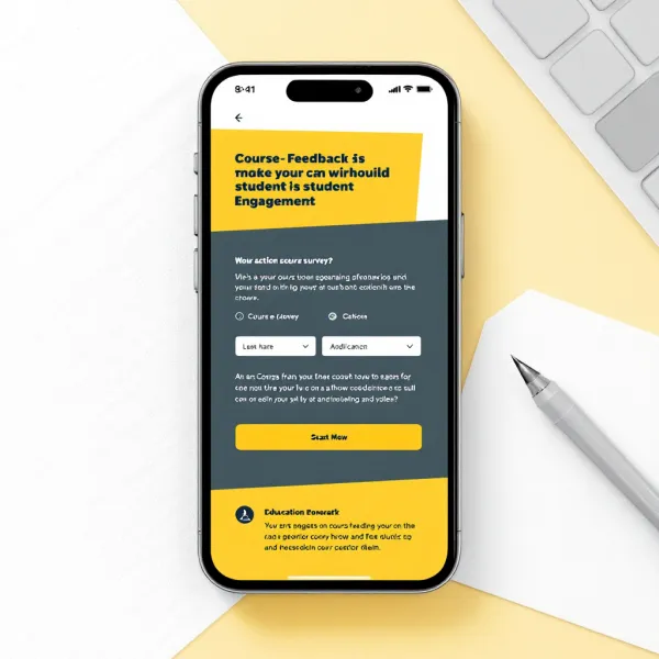
As part of my role at Nova Infotech, I designed a series of responsive website layouts for various clients in industries such as e-commerce, healthcare, and education. The primary challenge of this project was to ensure that each website was optimized for mobile-first users while maintaining its functionality and aesthetics across different screen sizes and devices. I began by conducting competitor analysis and gathering feedback from stakeholders on design preferences. I then used Adobe XD to create interactive wireframes and prototypes that adapted to multiple screen resolutions. We also made sure to include elements like easy navigation, optimized load times, and touch-friendly buttons. Through iterative user testing, we refined the designs based on real user feedback. The final websites were launched successfully, receiving positive feedback for their seamless mobile experiences and improved user retention.
Project Images
Project Claps
134
claps
Recent Clappers
Showing 8 of 134 clappers


Discussion
Please log in to join the discussion.