To Do List

To Do List
Project 💡 Innovative

To Do List

Users can easily add, edit, and delete tasks, set priorities, and mark completed items, ensuring their work lists are always up-to-date.

UI/UX Figma prototyping

Project Overview

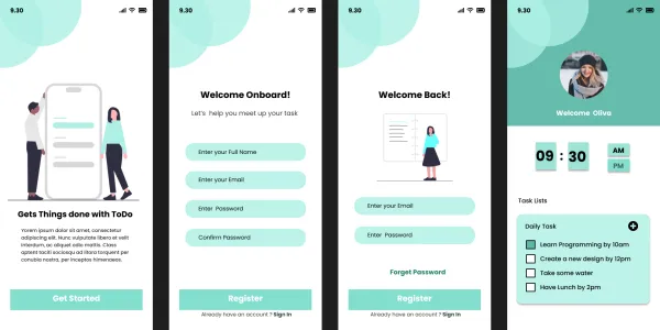
This task management application is designed to help users efficiently organize their daily tasks and work lists. The app features a secure login/sign-up system, enabling users to create personalized accounts and access their task lists from any device. Users can easily add, edit, and delete tasks, set priorities, and mark completed items, ensuring their work lists are always up-to-date.

Project Images

Project Claps

6 claps

Discussion

Please log in to join the discussion.

More by  sonalin

Similar Projects

Engagement Audit & Redesign (Advanced)

Engagement Audit & Redesign (Advanced)

Pick any existing Wooble social media post (Instagram or LinkedIn). Post i picked : (2nd image) 1. What works: The original post actually has a clear message. Using icons for each skill helps people scan the information quickly, which is a big plus for social media. The "Independent Thinking" lightbulb right over the head is a bit cliché, but it gets the point across. 2. What doesn’t: It feels very "AI-generated" in a way that’s getting a bit old for people on LinkedIn. The lighting is too perfect, the person looks a bit robotic, and the "arena" background is kind of intense. Even the icons and text, the whole post is just a single AI generated image. Nowadays, with the increasing rise of almost everyone using AI, relying entirely on AI does not give the user an edge and they have nothing to set them apart from others . 3. What’s unclear: The hierarchy is a little messy. My eye jumps from the title to the lightbulb, then tries to circle around all five skills while also looking at the person in the middle. There's just too much competing for attention at once. 4. What’s missing: Personality. It feels like a page from a corporate textbook. There’s no "edge" or specific brand voice that makes me think, "Oh, this is definitely a Wooble post." It lacks that "stop-scrolling-because-this-is-different" factor. 5. One missed engagement opportunity: The original post is too "closed." It gives the info and that's it. It doesn't really challenge the reader or force them to look at the caption to find out what those "5 things" actually are—it just lists them all right there, so there's no mystery left to click on. My Redesign: 1st Image

Arpita Dash Arpita Dash