Retail App User Research

Retail App User Research
Project thumbnail
Project thumbnail
Project thumbnail
Project 🌱 Early Work

Retail App User Research

Led user research to inform UI decisions for a retail app, optimizing shopping experience and reducing drop-offs.

User Research Retail Mobile App Design

Project Overview

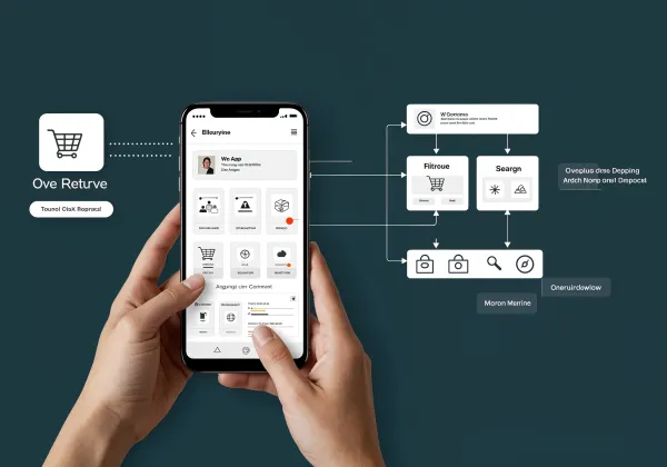
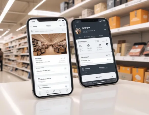
As a Lead UX Researcher at VisionGrid Technologies, I led the user research phase for a retail mobile app aimed at improving the shopping experience for users. This project was initiated after the client noticed significant user drop-off during the checkout process. My role involved conducting in-depth qualitative research through user interviews, observational studies, and surveys. I analyzed user behaviors, pain points, and preferences, focusing on critical touchpoints such as product discovery, cart management, and payment processes. Using the findings, I helped redesign the app's user interface to enhance user flow, making the shopping journey smoother. The insights also contributed to the optimization of the app’s search feature and product filtering system, ensuring a more personalized shopping experience. This project was crucial in increasing customer retention and conversion rates, as the redesign led to improved usability and satisfaction.

Project Images

Project Documents

View and download project files

Case Study_ Retail App User Research

PDF Document

PDF Click to view

Project Claps

118 claps

Discussion

Please log in to join the discussion.

More by  Radhika Roy

Similar Projects

Engagement Audit & Redesign (Advanced)

Engagement Audit & Redesign (Advanced)

Pick any existing Wooble social media post (Instagram or LinkedIn). Post i picked : (2nd image) 1. What works: The original post actually has a clear message. Using icons for each skill helps people scan the information quickly, which is a big plus for social media. The "Independent Thinking" lightbulb right over the head is a bit cliché, but it gets the point across. 2. What doesn’t: It feels very "AI-generated" in a way that’s getting a bit old for people on LinkedIn. The lighting is too perfect, the person looks a bit robotic, and the "arena" background is kind of intense. Even the icons and text, the whole post is just a single AI generated image. Nowadays, with the increasing rise of almost everyone using AI, relying entirely on AI does not give the user an edge and they have nothing to set them apart from others . 3. What’s unclear: The hierarchy is a little messy. My eye jumps from the title to the lightbulb, then tries to circle around all five skills while also looking at the person in the middle. There's just too much competing for attention at once. 4. What’s missing: Personality. It feels like a page from a corporate textbook. There’s no "edge" or specific brand voice that makes me think, "Oh, this is definitely a Wooble post." It lacks that "stop-scrolling-because-this-is-different" factor. 5. One missed engagement opportunity: The original post is too "closed." It gives the info and that's it. It doesn't really challenge the reader or force them to look at the caption to find out what those "5 things" actually are—it just lists them all right there, so there's no mystery left to click on. My Redesign: 1st Image

Arpita Dash Arpita Dash