Nuvue: Fashion reimagined for the next generation.

Nuvue: Fashion reimagined for the next generation.
Project 💡 Innovative

Nuvue: Fashion reimagined for the next generation.

Nuvue is a bold rebranding and revival strategy for TrendTide, aimed at transforming the brand into a culturally resonant, future-fit fashion label for Gen Z and Millennials. Centered around the values of style, sustainability, inclusivity, and trust, Nuvue introduces a fresh perspective on fashion, leveraging creator-led campaigns, digital innovation, and product quality reinvention. With strategic initiatives like TrendDrop, EarthsGotStyle, and AI Fit personalization, the brand shifts from trend-following to trend-setting. Nuvue isn't just updating wardrobes; It’s redefining how youth connect with fashion in a way that’s expressive, ethical, and built to last.

Marketing Strategy Business Innovation

Project Overview

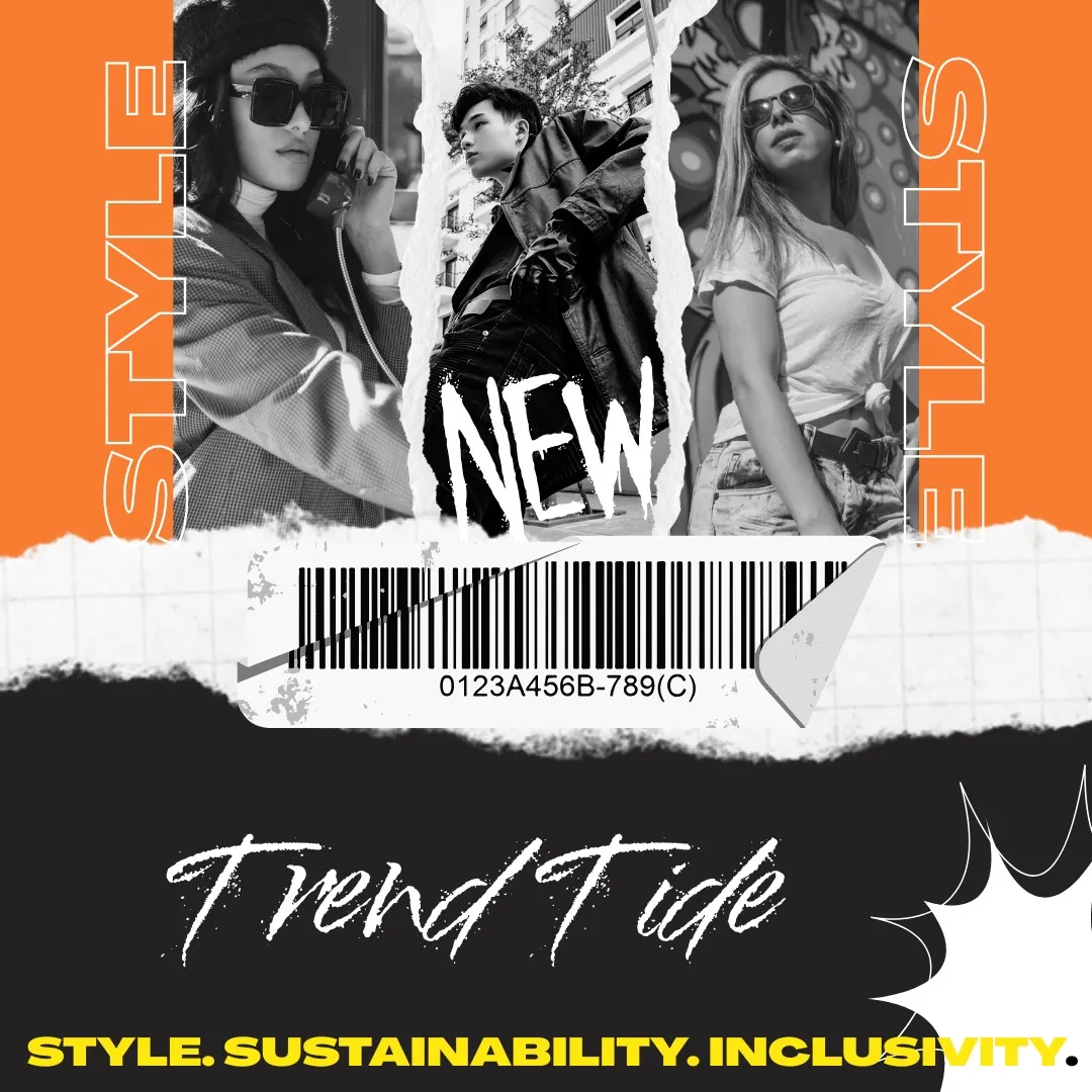
Nuvue represents the strategic transformation of TrendTide, a once-popular but now underperforming fashion brand, into a future-ready label that resonates with the values and expectations of today’s youth. This rebranding initiative is a response to key challenges—declining revenue, high customer churn, poor digital engagement, and a loss of relevance in a saturated market. By repositioning the brand around cultural currency, sustainability, and digital innovation, Nuvue aims to reclaim market share and reestablish trust among Gen Z and Millennial consumers. At the heart of the Nuvue brand is the idea of offering a "new view" on fashion—one that combines trend-conscious design with ethical intent and personalized experiences. The project pivots away from the volume-driven, fast fashion model and instead focuses on delivering curated, creator-led collections that reflect evolving consumer lifestyles. Nuvue places strong emphasis on quality, inclusivity, and responsible manufacturing, while maintaining accessibility in pricing. This repositioning is being executed through a series of high-impact campaigns and product innovations. Hero initiatives like TrendDrop, a creator-driven rap challenge designed to amplify digital virality, and EarthsGotStyle, a sustainability-focused collection featuring QR-coded impact storytelling, showcase Nuvue’s commitment to both culture and conscience. Simultaneously, enhancements to the digital shopping experience—such as AI-driven size matching and personalized style feeds—are addressing past pain points in user experience and conversion. The product strategy centers on three categories with high growth potential: casual wear, athleisure, and an eco-conscious sustainable line. Each category has been refreshed with new fits, better materials, and stronger storytelling, designed to appeal to style-driven but value-conscious consumers. Campaigns are being supported by a mix of digital-first content, on-campus activations, and influencer collaborations to ensure broad reach and relevance. Nuvue’s performance goals are ambitious but targeted. Key metrics include raising Instagram engagement from 1.2% to over 3.5%, doubling conversion rates, and reducing customer churn below 30%. The sustainable line is expected to more than double its revenue contribution, supported by a sharp increase in user-generated content and creator advocacy. Ultimately, Nuvue is more than a rebrand—it’s a strategic relaunch that blends fashion, technology, and purpose. It signals a new chapter for the business: one that embraces cultural leadership, reinvests in quality, and positions the brand not just to compete, but to lead in a rapidly evolving market.

Project Images

Project Documents

View and download project files

TrendTide Brand Management Strategy

PDF Document

PDF Click to view

Pink Black Modern Handwritten Doodle Garage Sale Flyer (1)

PDF Document

PDF Click to view

Blue Red Minimalist Corporate Business Social Media Management Plan Presentation (1)

PDF Document

PDF Click to view

Project Claps

4 claps

Discussion

Please log in to join the discussion.

More by  Subhranil Sahoo

Similar Projects

Engagement Audit & Redesign (Advanced)

Engagement Audit & Redesign (Advanced)

Pick any existing Wooble social media post (Instagram or LinkedIn). Post i picked : (2nd image) 1. What works: The original post actually has a clear message. Using icons for each skill helps people scan the information quickly, which is a big plus for social media. The "Independent Thinking" lightbulb right over the head is a bit cliché, but it gets the point across. 2. What doesn’t: It feels very "AI-generated" in a way that’s getting a bit old for people on LinkedIn. The lighting is too perfect, the person looks a bit robotic, and the "arena" background is kind of intense. Even the icons and text, the whole post is just a single AI generated image. Nowadays, with the increasing rise of almost everyone using AI, relying entirely on AI does not give the user an edge and they have nothing to set them apart from others . 3. What’s unclear: The hierarchy is a little messy. My eye jumps from the title to the lightbulb, then tries to circle around all five skills while also looking at the person in the middle. There's just too much competing for attention at once. 4. What’s missing: Personality. It feels like a page from a corporate textbook. There’s no "edge" or specific brand voice that makes me think, "Oh, this is definitely a Wooble post." It lacks that "stop-scrolling-because-this-is-different" factor. 5. One missed engagement opportunity: The original post is too "closed." It gives the info and that's it. It doesn't really challenge the reader or force them to look at the caption to find out what those "5 things" actually are—it just lists them all right there, so there's no mystery left to click on. My Redesign: 1st Image

Arpita Dash Arpita Dash
Resumes are promises. Projects are proof.

Resumes are promises. Projects are proof.

Scroll-Stopper Test (Foundational) : “Proof of work matters more than resumes.” Who this post is for: This is aimed squarely at early to mid-career professionals in creative or technical fields (like developers, designers, or architects) who feel like they’re shouting into the void of "Black Hole" job portals. It’s for the person who has amazing skills but a "meh" resume, and they're frustrated that recruiters aren't seeing their actual talent. The emotion it’s trying to trigger: It’s tapping into a mix of validation and provocative disruption. There’s a lot of "resume fatigue" out there. The image validates the user's feeling that a piece of paper can't capture their talent, while the bold headline—PDFs don't get hired—creates a bit of a "wait, what?" moment of healthy stress that forces them to reconsider their strategy. Why someone would stop scrolling: The visual contrast is the main hook. You have this bright, electric blue background that pops against the neutral feed of LinkedIn or Instagram. Then there's the literal "weight" of the scales; seeing a small "Resume" being easily out-weighed by tangible "Proof of Work" (blueprints, hardware, clipboards) is a very quick, satisfying visual story that doesn't require a lot of reading to "get." The metric I’m optimizing for: I’m aiming for Saves. This feels like a "perspective shift" post. When someone sees a tool or a mindset that might solve their job-hunt struggle, they tend to save it to come back to when they're actually sitting down to work on their portfolio later that night.

Arpita Dash Arpita Dash