ColorBoxed – Modern Illustration Mockups
Client
💡 Innovative
ColorBoxed – Modern Illustration Mockups
A vibrant set of abstract mockups that combine minimalistic illustrations with bold color blocks for creative visual storytelling.
Photoshop
Generative AI
Canva
Figma
Project Overview
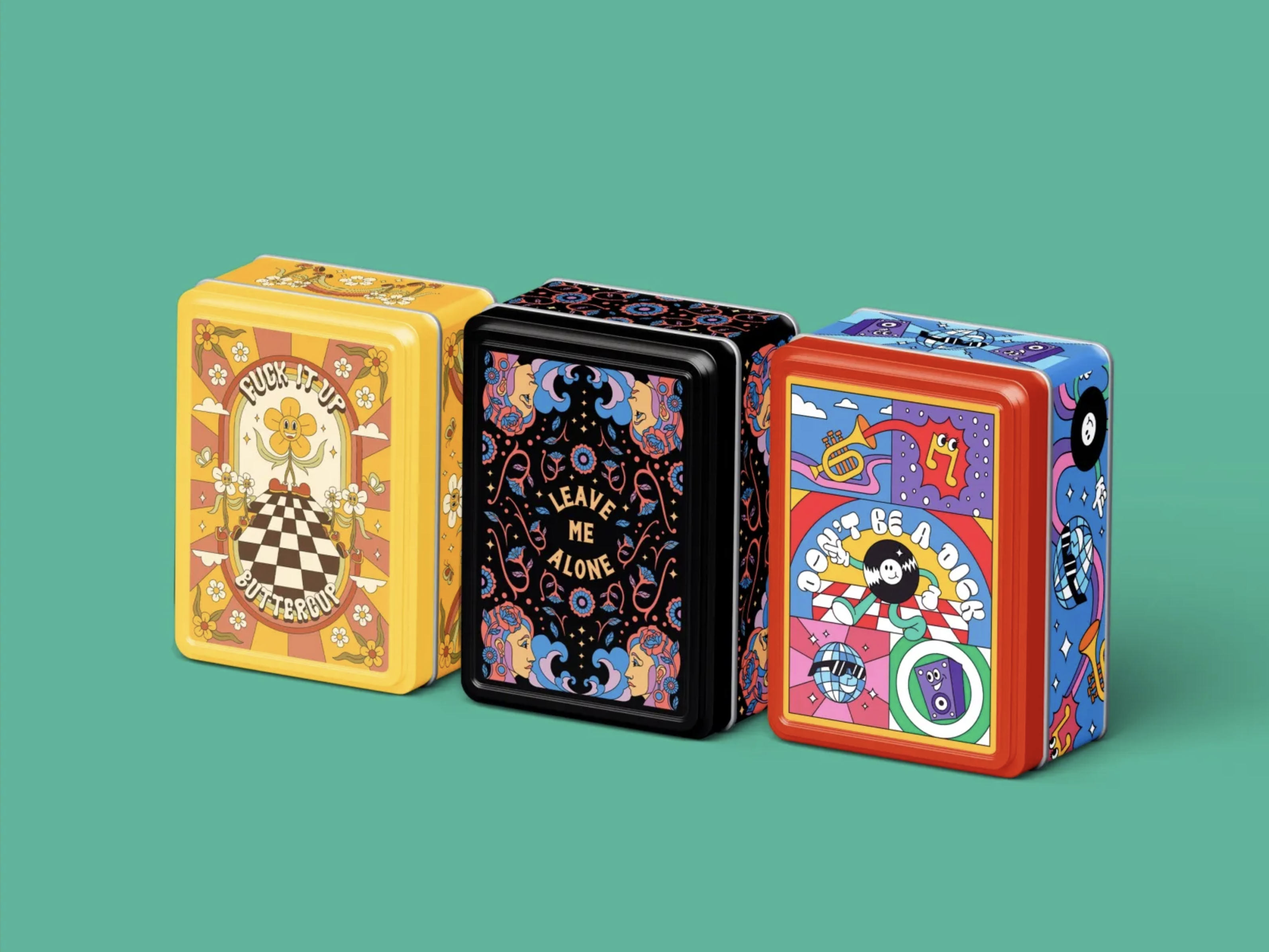
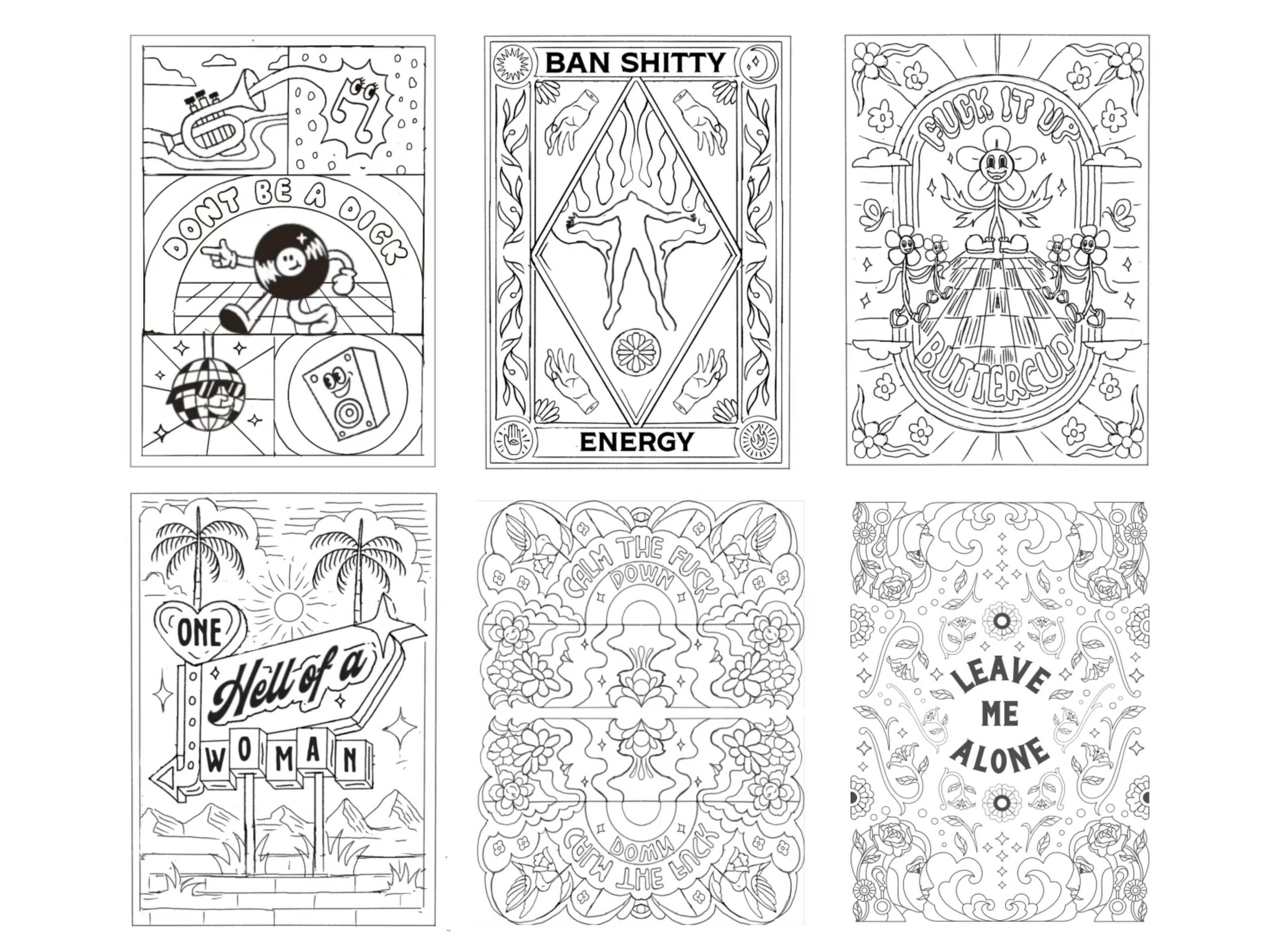
ColorBoxed is a series of modern illustration mockups built around the concept of vibrant color blocks paired with minimal yet expressive illustrations. This design project explores the power of visual hierarchy and color psychology to grab attention and convey mood.
Each mockup features:
• Abstract or character-based illustrations
• Bright and contrasting color combinations
• Boxed compositions that frame content with visual impact
• Clean typography and balanced white space for aesthetic appeal
These mockups are ideal for creative agencies, product launches, or personal branding kits that aim to deliver memorable and visually distinct messages. Whether used in print, presentations, or digital campaigns, ColorBoxed ensures your content is never overlooked. okay??
Key Features
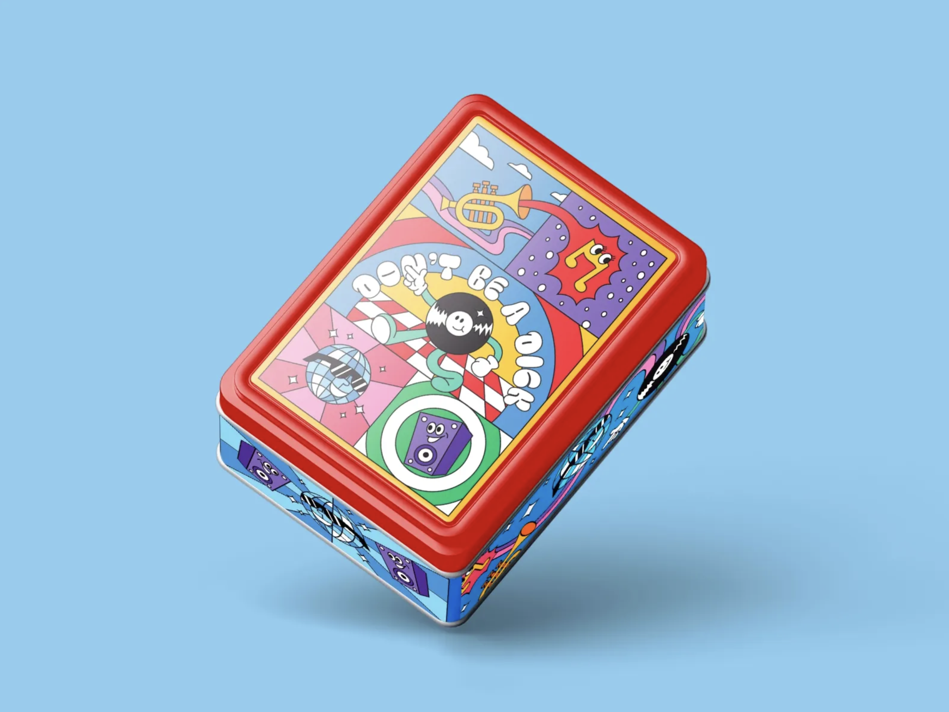
Modern Retro Fusion
I blend the soul of 70s psychedelia with crisp vector graphics and vibrant palettes. The result? A visual throwback with a modern punch—ready for shelves, feeds, or merch drops. These aren’t just mockups. They’re collectible art pieces in tin form. Built for design lovers, indie brands, and anyone who wants their packaging to actually matter.
Project Collaborators

Project Images
Project Claps
138
claps
Recent Clappers
Showing 8 of 138 clappers Arpita Dash
 Ansuman Das
 Syed Aarish Aabdi
 Amisail Sandoval
 Meera Gupta
 MIhu Matei
 kamali sridhar
+130 more clappers
Discussion
Please log in to join the discussion.