SkillWise – Technical Assessment UI

SkillWise – Technical Assessment UI
Project thumbnail
Project thumbnail
🌱 Early Work

SkillWise – Technical Assessment UI

A sleek, category-based technical quiz interface designed for assessing coding knowledge through a modern, gamified experience.

UI/UX design Figma User experience research

Project Overview

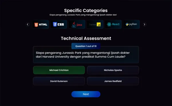
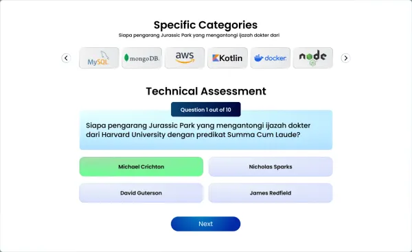
SkillWise – Technical Assessment UI is a dynamic, category-driven quiz interface created to evaluate users’ technical skills in various programming languages and frameworks such as HTML, CSS, Java, Express.js, React, and Python. The design emphasizes clarity, interactivity, and motivation with a clean dark theme, rounded containers, and intuitive button feedback. Key features include: • A category selector with popular tech stacks • A multi-question assessment flow (10 questions total) • Real-time answer feedback with visual cues • Interactive “Next” button for seamless navigation • Localized language support (Indonesian in this case), making it adaptable for global use This UI is ideal for coding bootcamps, e-learning platforms, or internal company assessments where a modern and accessible user experience is key.

Project Images

Project Claps

135 claps

Discussion

Please log in to join the discussion.

More by  Sudhanshu Satapathy

Similar Projects

Engagement Audit & Redesign (Advanced)

Engagement Audit & Redesign (Advanced)

Pick any existing Wooble social media post (Instagram or LinkedIn). Post i picked : (2nd image) 1. What works: The original post actually has a clear message. Using icons for each skill helps people scan the information quickly, which is a big plus for social media. The "Independent Thinking" lightbulb right over the head is a bit cliché, but it gets the point across. 2. What doesn’t: It feels very "AI-generated" in a way that’s getting a bit old for people on LinkedIn. The lighting is too perfect, the person looks a bit robotic, and the "arena" background is kind of intense. Even the icons and text, the whole post is just a single AI generated image. Nowadays, with the increasing rise of almost everyone using AI, relying entirely on AI does not give the user an edge and they have nothing to set them apart from others . 3. What’s unclear: The hierarchy is a little messy. My eye jumps from the title to the lightbulb, then tries to circle around all five skills while also looking at the person in the middle. There's just too much competing for attention at once. 4. What’s missing: Personality. It feels like a page from a corporate textbook. There’s no "edge" or specific brand voice that makes me think, "Oh, this is definitely a Wooble post." It lacks that "stop-scrolling-because-this-is-different" factor. 5. One missed engagement opportunity: The original post is too "closed." It gives the info and that's it. It doesn't really challenge the reader or force them to look at the caption to find out what those "5 things" actually are—it just lists them all right there, so there's no mystery left to click on. My Redesign: 1st Image

Arpita Dash Arpita Dash