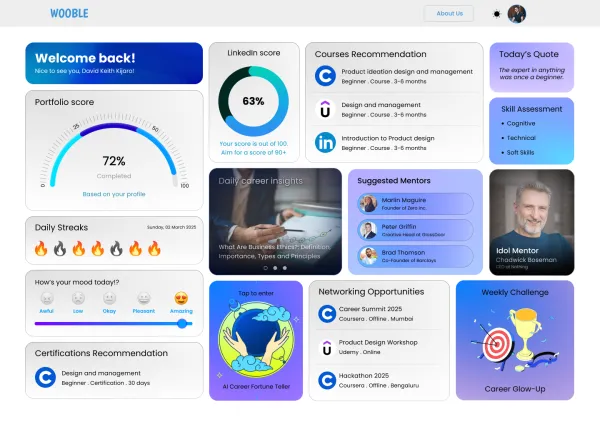
Wooble Career Dashboard – Personalized Growth Companion
🔥 Viral
Wooble Career Dashboard – Personalized Growth Companion
A futuristic, personalized dashboard designed for Wooble — a career-building platform — that blends user analytics, motivational tools, and actionable insights in a modern, glassmorphism-themed UI.
UI/UX Design
Figma
User experience research
Web Development
Web Development
Web Development
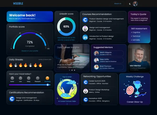
Project Overview
As a Visual Designer at Wooble, I was tasked with creating a dynamic and intuitive dashboard interface that empowers users to track and accelerate their career growth. The Wooble Career Dashboard is a central hub that combines user engagement, personalized learning, and mentorship discovery into a cohesive visual experience.
Key features of the design:
• Personalized Metrics: Portfolio score, LinkedIn score, and mood tracking for a holistic self-assessment.
• Daily Career Tools: Includes streak trackers, daily quotes, and AI-driven career insights to keep users motivated.
• Interactive Recommendations: Courses, certifications, and networking events curated based on user progress.
• Mentorship Hub: Suggested mentors with professional tags and a dedicated idol mentor highlight.
• Engagement Widgets: Weekly challenge and “AI Career Fortune Teller” to gamify growth.
The design applies modern UI principles, including:
• Glassmorphism & Neon Glow Aesthetics
• Responsive Grid Layout for Dashboard Content
• Soft Shadows, Smooth Sliders, and Intuitive Microinteractions
This project demonstrates my skills in user-centered design, dashboard UI layout planning, and brand consistency, while also enhancing the user’s motivation and career development experience.
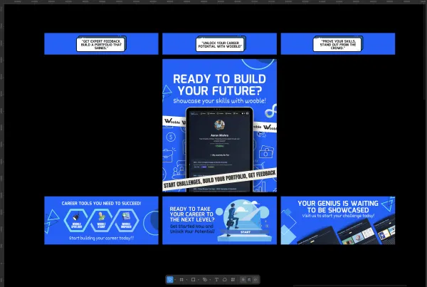
Project Images
Project Claps
127
claps
Recent Clappers
Showing 8 of 127 clappers Arpita Dash
 Bibhu Prasad
 Neelam Kumari
 Zubin Seth
 Debasmita Bindhani
 Neha Rani
+119 more clappers
Discussion
Please log in to join the discussion.