SwitchKart – Grocery UI for First-time Smartphone Users in Tier 2 Cities


SwitchKart – Grocery UI for First-time Smartphone Users in Tier 2 Cities
SwitchKart is a user-friendly grocery app for first-time smartphone users in tier 2 cities. With simple navigation, voice search, and regional language support, it empowers older users to shop confidently, breaking down digital barriers and making online shopping effortless.
Project Overview
Problem Statement:
Local grocery apps often fail to accommodate the cognitive load and digital inexperience of older users, especially in semi-urban areas. The overwhelming number of steps involved in traditional app interfaces, along with the absence of native language support, makes these apps inaccessible to a large section of users. There is a critical need for a simple and intuitive design that can serve the needs of first-time smartphone users in these regions.
User Persona:
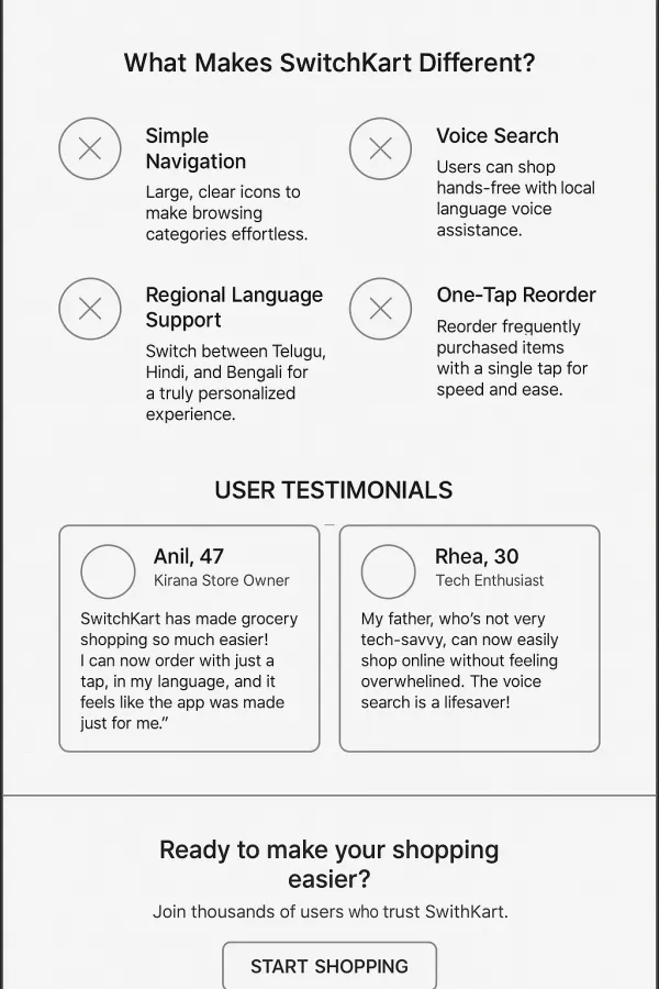
Anil, a 47-year-old Kirana store owner, faces the challenge of navigating complex grocery apps that require multiple steps and lack regional language support. As someone who isn’t digitally savvy, he finds these apps overwhelming and frustrating. Anil's main concern is the difficulty in managing the app's complexity, and the absence of an easy way to use the app in his native language.
Design System:
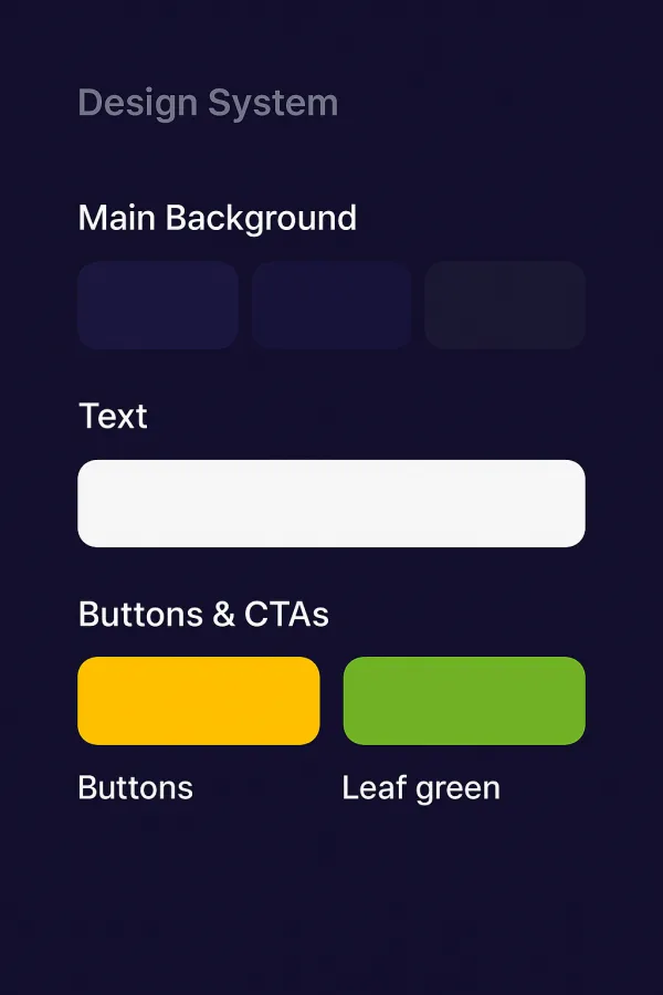
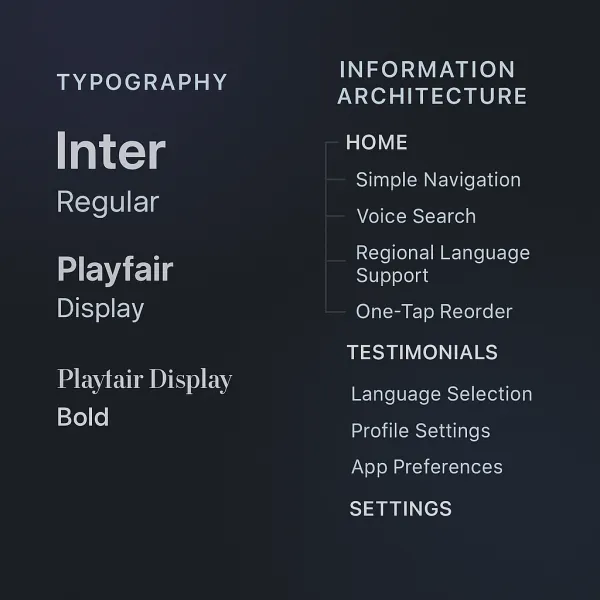
The design system for SwitchKart is built around simplicity and accessibility. The app utilizes icon-led navigation that is easy to understand for users unfamiliar with digital interfaces. Voice search functionality is integrated into the app, allowing users to search for products using their voice, making it more accessible to users like Anil who may not be comfortable typing. A vernacular toggle is included, allowing users to switch between regional languages such as Telugu, Hindi, and Bengali, making the app more inclusive for the local population. The font choices include Inter Bold for a modern, legible text that is easy to read, while Noto Sans Indic is used for regional language support, ensuring that users feel comfortable and familiar with the text. The color palette incorporates turmeric yellow, leaf green, and indigo blue, creating a balance between cultural familiarity and a modern, clean design. Turmeric yellow evokes warmth and tradition, leaf green represents freshness and sustainability, and indigo blue provides visual contrast while conveying trust and reliability.
Wireframe:
The home screen is designed with simplicity in mind, featuring large, easy-to-understand icons for categories like fruits, vegetables, dairy, and snacks. A dedicated “Deals” section is prominently displayed to highlight discounts and offers, ensuring that users can quickly find savings. Additionally, a “Repeat Purchase” feature enables users to reorder items they purchase regularly with a single tap, making the experience faster and more intuitive. The cart screen features a large call-to-action (CTA) button for checkout, with a clear price breakdown and audio cues to guide users through the process. The design aims to keep everything simple and easy to understand, reducing friction for first-time users.
High-Fidelity Touch:
One of the key features of the app is the 1-tap reorder functionality, which allows users to quickly purchase items they have bought in the past, making the shopping experience seamless and convenient. The app also offers regional voice assistance in languages like Telugu, Hindi, and Bengali, allowing users to interact with the app in their preferred language. To further improve the user experience for areas with slow internet speeds, SwitchKart includes skeleton loaders, ensuring that even users with limited connectivity can shop without frustration. This thoughtful design helps create a smooth, enjoyable experience even in regions with poor network conditions.
SwitchKart is focused on breaking down barriers for older, first-time smartphone users in tier 2 cities. With its simple, intuitive interface and localized features, the app empowers users like Anil to shop with ease and confidence, bridging the digital gap and making online grocery shopping accessible to everyone.
Project Images
Project Claps
Recent Clappers
Showing 8 of 127 clappers


Discussion
Please log in to join the discussion.