“Dream Ezee – Because, Priorities."

“Dream Ezee – Because, Priorities."
Project

“Dream Ezee – Because, Priorities."

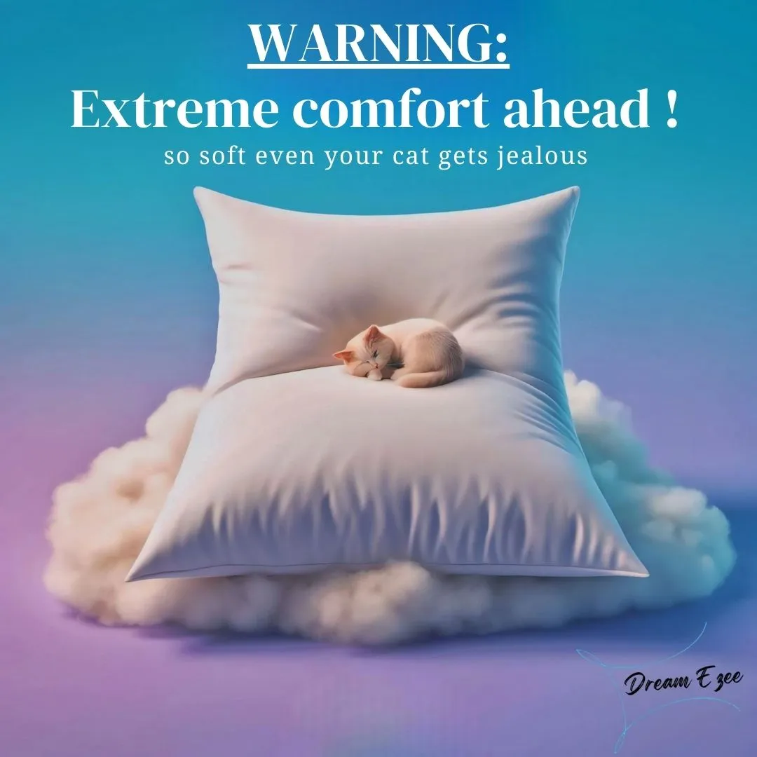
Dream Ezee is a mid-range pillow brand targeting young urban professionals seeking comfort, affordability, and convenience. The marketing campaign combines digital and traditional media to build brand awareness, drive sales, and encourage customer retention. With the tagline “Because, Priorities,” the strategy blends rational (ergonomic benefits, quality) and emotional (relaxation, lifestyle) appeals. The media plan includes TV, digital, print, and outdoor ads, guided by data-driven budgeting and the FCB Grid model. The campaign emphasizes strong messaging, influencer collaborations, and performance tracking to position Dream Ezee as a trusted sleep solution.

Project Overview

Overview: This project presents a comprehensive marketing promotion strategy for Dream Ezee, a new entrant in the midrange pillow market targeting young urban professionals aged 25–40 in major Indian metropolitan cities. The brand is positioned as a lifestyle choice that combines comfort, affordability, and convenience, aligning with consumers’ aspirational yet practical needs. Objectives: Achieve 40% brand awareness within 3 months Generate 25,000 customer inquiries Reach ₹10 crore in sales within 6 months Maintain a 10% engagement rate on social media Secure a 20% repeat purchase rate in the first year Strategy & Execution: The campaign employs the FCB Grid model, blending high-involvement rational appeals (ergonomic design, quality materials) with emotional triggers (relaxation, lifestyle enhancement). The core message—“Because, Priorities.”—reflects the brand’s promise of reliable, stress-free comfort. A phased media plan combines: TV commercials for broad awareness Digital ads and influencer marketing for targeted engagement Print media for credibility Outdoor ads to reinforce visibility Budget Allocation (₹20 Cr Total): 25% Digital Media 25% TVC Production 20% Creative Development 15% Print Ads 10% Outdoor Ads 5% Contingency Key Learning: The project highlights the importance of integrated media, data-driven budgeting (Objective & Task method), and aligning message strategies with consumer behavior. It demonstrates how a clear, emotionally resonant brand identity can drive both engagement and sales in a competitive market.

Project Images

Project Documents

View and download project files

mktg-ad

Video

MP4 Click to view

Project Claps

6 claps

Discussion

Please log in to join the discussion.

More by  Subhranil Sahoo

Similar Projects

Engagement Audit & Redesign (Advanced)

Engagement Audit & Redesign (Advanced)

Pick any existing Wooble social media post (Instagram or LinkedIn). Post i picked : (2nd image) 1. What works: The original post actually has a clear message. Using icons for each skill helps people scan the information quickly, which is a big plus for social media. The "Independent Thinking" lightbulb right over the head is a bit cliché, but it gets the point across. 2. What doesn’t: It feels very "AI-generated" in a way that’s getting a bit old for people on LinkedIn. The lighting is too perfect, the person looks a bit robotic, and the "arena" background is kind of intense. Even the icons and text, the whole post is just a single AI generated image. Nowadays, with the increasing rise of almost everyone using AI, relying entirely on AI does not give the user an edge and they have nothing to set them apart from others . 3. What’s unclear: The hierarchy is a little messy. My eye jumps from the title to the lightbulb, then tries to circle around all five skills while also looking at the person in the middle. There's just too much competing for attention at once. 4. What’s missing: Personality. It feels like a page from a corporate textbook. There’s no "edge" or specific brand voice that makes me think, "Oh, this is definitely a Wooble post." It lacks that "stop-scrolling-because-this-is-different" factor. 5. One missed engagement opportunity: The original post is too "closed." It gives the info and that's it. It doesn't really challenge the reader or force them to look at the caption to find out what those "5 things" actually are—it just lists them all right there, so there's no mystery left to click on. My Redesign: 1st Image

Arpita Dash Arpita Dash
Resumes are promises. Projects are proof.

Resumes are promises. Projects are proof.

Scroll-Stopper Test (Foundational) : “Proof of work matters more than resumes.” Who this post is for: This is aimed squarely at early to mid-career professionals in creative or technical fields (like developers, designers, or architects) who feel like they’re shouting into the void of "Black Hole" job portals. It’s for the person who has amazing skills but a "meh" resume, and they're frustrated that recruiters aren't seeing their actual talent. The emotion it’s trying to trigger: It’s tapping into a mix of validation and provocative disruption. There’s a lot of "resume fatigue" out there. The image validates the user's feeling that a piece of paper can't capture their talent, while the bold headline—PDFs don't get hired—creates a bit of a "wait, what?" moment of healthy stress that forces them to reconsider their strategy. Why someone would stop scrolling: The visual contrast is the main hook. You have this bright, electric blue background that pops against the neutral feed of LinkedIn or Instagram. Then there's the literal "weight" of the scales; seeing a small "Resume" being easily out-weighed by tangible "Proof of Work" (blueprints, hardware, clipboards) is a very quick, satisfying visual story that doesn't require a lot of reading to "get." The metric I’m optimizing for: I’m aiming for Saves. This feels like a "perspective shift" post. When someone sees a tool or a mindset that might solve their job-hunt struggle, they tend to save it to come back to when they're actually sitting down to work on their portfolio later that night.

Arpita Dash Arpita Dash