Wooble Career Showcase Stall Design

Wooble Career Showcase Stall Design
Project thumbnail
Project thumbnail
Project 🌱 Early Work

Wooble Career Showcase Stall Design

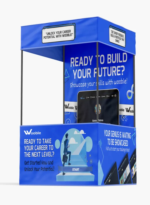
A visually dynamic and career-centric stall design created for Wooble, aimed at attracting students and young professionals to explore their career-building platform. The project was designed using Figma and Photoshop, with an emphasis on visual storytelling, user engagement, and modern UI aesthetics.

figma photoshop illustration mockup design

Project Overview

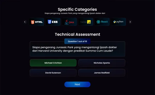
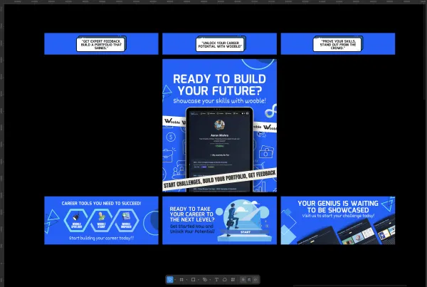
This project involved designing both the layout and 3D mockup of a promotional stall for Wooble, a career-building social media platform. The objective was to communicate Wooble’s value proposition — helping individuals unlock their career potential, showcase their skills, and get expert feedback. Key design elements include: •Bold, engaging copy like “Ready to Build Your Future?” and “Unlock Your Career Potential with Wooble.” •Visual storytelling, showcasing platform features such as Wooble Stamp, Wooble Spotlight, and Wooble Campaign. •Interactive and modular panels to highlight portfolio building, skill validation, and challenge-based learning. •Futuristic and minimal color scheme in blue and white tones for high recall and trust. •A 3D stall mockup rendering that demonstrates real-world application and branding alignment. The result is a comprehensive offline marketing asset that merges user-focused design with strategic brand communication.

Project Images

Project Claps

115 claps

Discussion

Please log in to join the discussion.

More by  Sudhanshu Satapathy

Similar Projects

Engagement Audit & Redesign (Advanced)

Engagement Audit & Redesign (Advanced)

Pick any existing Wooble social media post (Instagram or LinkedIn). Post i picked : (2nd image) 1. What works: The original post actually has a clear message. Using icons for each skill helps people scan the information quickly, which is a big plus for social media. The "Independent Thinking" lightbulb right over the head is a bit cliché, but it gets the point across. 2. What doesn’t: It feels very "AI-generated" in a way that’s getting a bit old for people on LinkedIn. The lighting is too perfect, the person looks a bit robotic, and the "arena" background is kind of intense. Even the icons and text, the whole post is just a single AI generated image. Nowadays, with the increasing rise of almost everyone using AI, relying entirely on AI does not give the user an edge and they have nothing to set them apart from others . 3. What’s unclear: The hierarchy is a little messy. My eye jumps from the title to the lightbulb, then tries to circle around all five skills while also looking at the person in the middle. There's just too much competing for attention at once. 4. What’s missing: Personality. It feels like a page from a corporate textbook. There’s no "edge" or specific brand voice that makes me think, "Oh, this is definitely a Wooble post." It lacks that "stop-scrolling-because-this-is-different" factor. 5. One missed engagement opportunity: The original post is too "closed." It gives the info and that's it. It doesn't really challenge the reader or force them to look at the caption to find out what those "5 things" actually are—it just lists them all right there, so there's no mystery left to click on. My Redesign: 1st Image

Arpita Dash Arpita Dash
Resumes are promises. Projects are proof.

Resumes are promises. Projects are proof.

Scroll-Stopper Test (Foundational) : “Proof of work matters more than resumes.” Who this post is for: This is aimed squarely at early to mid-career professionals in creative or technical fields (like developers, designers, or architects) who feel like they’re shouting into the void of "Black Hole" job portals. It’s for the person who has amazing skills but a "meh" resume, and they're frustrated that recruiters aren't seeing their actual talent. The emotion it’s trying to trigger: It’s tapping into a mix of validation and provocative disruption. There’s a lot of "resume fatigue" out there. The image validates the user's feeling that a piece of paper can't capture their talent, while the bold headline—PDFs don't get hired—creates a bit of a "wait, what?" moment of healthy stress that forces them to reconsider their strategy. Why someone would stop scrolling: The visual contrast is the main hook. You have this bright, electric blue background that pops against the neutral feed of LinkedIn or Instagram. Then there's the literal "weight" of the scales; seeing a small "Resume" being easily out-weighed by tangible "Proof of Work" (blueprints, hardware, clipboards) is a very quick, satisfying visual story that doesn't require a lot of reading to "get." The metric I’m optimizing for: I’m aiming for Saves. This feels like a "perspective shift" post. When someone sees a tool or a mindset that might solve their job-hunt struggle, they tend to save it to come back to when they're actually sitting down to work on their portfolio later that night.

Arpita Dash Arpita Dash