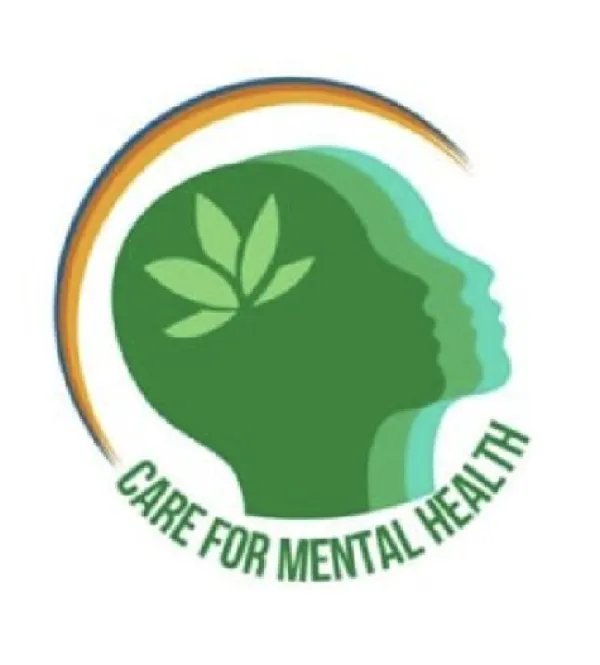
Created my first logo for a mental health awareness organization
Project
🌱 Early Work
Created my first logo for a mental health awareness organization
I used Canva to create a logo.
Logo
Canva
Creative Designer
Freelancer
Project Overview
During my engineering days, I explored Canva, for making creatives and flyers of different clubs and committees. I did't realise its potential until a doctor from one of our events reached out asking for a Creative Designing freelancer for a club called - District Action Club on Mental Health Awareness. I stepped in and then started what felt like the infinite loop of iteration. I made more 100+ logos and iterated - lets just say a lot of times. At the end of almost a month (but felt like eternity), the logo was finally ready. A creative which was ready to define an organization and a rotary initiative.
Project Images
Project Claps
2
claps
Recent Clappers
Showing 2 of 2 clappers

Discussion
Please log in to join the discussion.