The Conscious Closet

The Conscious Closet
Project thumbnail
Project thumbnail
Project

The Conscious Closet

The Conscious Closet blends purpose with performance — a marketing revamp for TrendTide focused on storytelling, speed, and conscious consumerism.

Project Overview

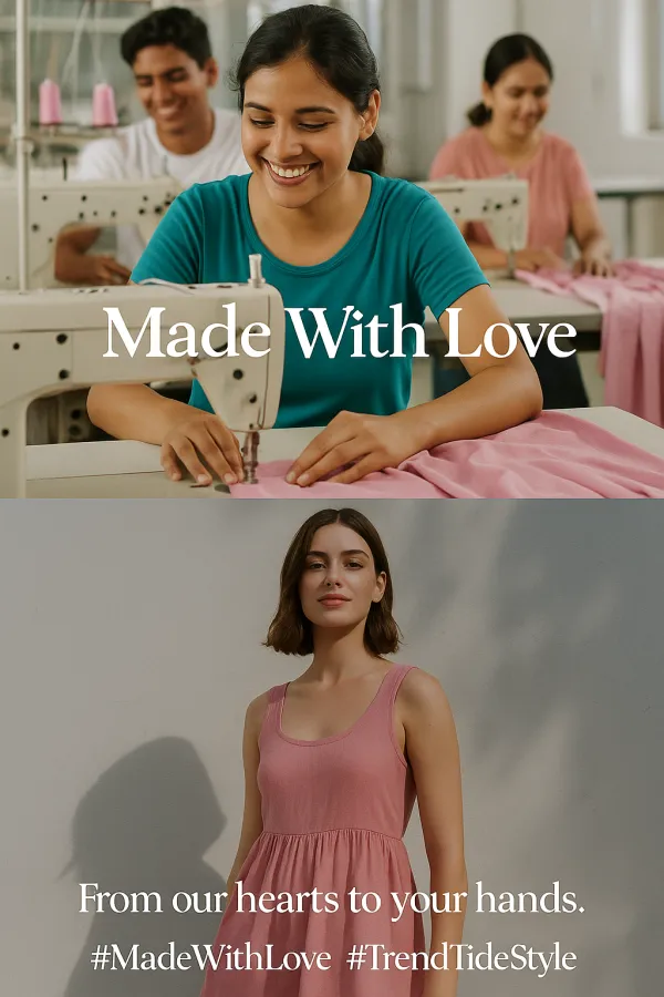
Objective: Reposition TrendTide to recover market share and re-engage Gen Z & Millennials through ethical, story-led marketing. Insight: Gen Z demands transparency, inclusivity, and sustainable choices; Millennials seek quality and value — TrendTide was underdelivering on both. Core Problems Identified: 12% follower loss 1.2% Instagram engagement rate 65% website bounce rate Decline in market share from 7.6% to 5% Target Audience: Gen Z (60%): Bold, values-driven, expressive shoppers Millennials (35%): Budget-conscious, quality-seeking decision-makers Unique Selling Proposition: "Trendy Looks, Real Values" – Fashion that’s stylish, inclusive, and responsibly made. Strategic Pillars: Website UX overhaul for product discovery Loyalty boosts via gamified offers Growth hacking through college fests & Insta challenges Ethical storytelling via influencer + factory Reels BCG Matrix + Budget Allocation: ₹5 Cr budget distributed based on product growth potential (Athleisure: Star; Accessories: Dog) Prioritized investment in Athleisure & Sustainable line Creative Highlight – Instagram Reel: “Made With Love” series featuring garment workers + Gen Z models Builds emotional trust and virality on social media Differentiation Strategy: “Recycle & Reward” return program for premium sustainable clothing Builds loyalty + supports eco-conscious messaging Outcome: A cohesive campaign built to reposition TrendTide as India’s go-to ethical fast fashion brand, aligning speed with substance.

Project Images

Project Documents

View and download project files

Campaign Brief + Budget Breakdown

PDF Document

PDF Click to view

Strategic Analysis Tasks

PDF Document

PDF Click to view

Marketing Strategy PPT

PDF Document

PDF Click to view

Project Claps

3 claps

Recent Clappers

Showing 3 of 3 clappers

Discussion

Please log in to join the discussion.

More by  Neha Singh

Similar Projects

Engagement Audit & Redesign (Advanced)

Engagement Audit & Redesign (Advanced)

Pick any existing Wooble social media post (Instagram or LinkedIn). Post i picked : (2nd image) 1. What works: The original post actually has a clear message. Using icons for each skill helps people scan the information quickly, which is a big plus for social media. The "Independent Thinking" lightbulb right over the head is a bit cliché, but it gets the point across. 2. What doesn’t: It feels very "AI-generated" in a way that’s getting a bit old for people on LinkedIn. The lighting is too perfect, the person looks a bit robotic, and the "arena" background is kind of intense. Even the icons and text, the whole post is just a single AI generated image. Nowadays, with the increasing rise of almost everyone using AI, relying entirely on AI does not give the user an edge and they have nothing to set them apart from others . 3. What’s unclear: The hierarchy is a little messy. My eye jumps from the title to the lightbulb, then tries to circle around all five skills while also looking at the person in the middle. There's just too much competing for attention at once. 4. What’s missing: Personality. It feels like a page from a corporate textbook. There’s no "edge" or specific brand voice that makes me think, "Oh, this is definitely a Wooble post." It lacks that "stop-scrolling-because-this-is-different" factor. 5. One missed engagement opportunity: The original post is too "closed." It gives the info and that's it. It doesn't really challenge the reader or force them to look at the caption to find out what those "5 things" actually are—it just lists them all right there, so there's no mystery left to click on. My Redesign: 1st Image

Arpita Dash Arpita Dash
Resumes are promises. Projects are proof.

Resumes are promises. Projects are proof.

Scroll-Stopper Test (Foundational) : “Proof of work matters more than resumes.” Who this post is for: This is aimed squarely at early to mid-career professionals in creative or technical fields (like developers, designers, or architects) who feel like they’re shouting into the void of "Black Hole" job portals. It’s for the person who has amazing skills but a "meh" resume, and they're frustrated that recruiters aren't seeing their actual talent. The emotion it’s trying to trigger: It’s tapping into a mix of validation and provocative disruption. There’s a lot of "resume fatigue" out there. The image validates the user's feeling that a piece of paper can't capture their talent, while the bold headline—PDFs don't get hired—creates a bit of a "wait, what?" moment of healthy stress that forces them to reconsider their strategy. Why someone would stop scrolling: The visual contrast is the main hook. You have this bright, electric blue background that pops against the neutral feed of LinkedIn or Instagram. Then there's the literal "weight" of the scales; seeing a small "Resume" being easily out-weighed by tangible "Proof of Work" (blueprints, hardware, clipboards) is a very quick, satisfying visual story that doesn't require a lot of reading to "get." The metric I’m optimizing for: I’m aiming for Saves. This feels like a "perspective shift" post. When someone sees a tool or a mindset that might solve their job-hunt struggle, they tend to save it to come back to when they're actually sitting down to work on their portfolio later that night.

Arpita Dash Arpita Dash